under construction
Week 7, Oct 17-21
Balance in art refers to the sense of distribution of perceived visual weights of the elements that offset one another. There are 3 kinds of balance:
Copy all the Vocabulary Notes below:
Composition: the way in which something is put together or arranged : the combination of parts or elements that make up something (like writing an essay or composition in English class, or composing a piece of music, ART also needs composing using the Elements of Art and the Principles of Design).
Composition: the way in which something is put together or arranged : the combination of parts or elements that make up something (like writing an essay or composition in English class, or composing a piece of music, ART also needs composing using the Elements of Art and the Principles of Design).
Balance in art refers to the sense of distribution of perceived visual weights of the elements that offset one another. A balanced composition feels right. It feels stable and aesthetically pleasing. While some of its elements might be focal points and attract your eye, no one area of the composition draws your eye so much that you can’t see the other areas. Our Project will teach us about two kinds of balance, symmetrical balance and Radial balance.

This is an asymmetrical photo:

This is an Asymmetric Photograph
This is a symmetrical photo:

|
Notes for 10-17 & 10-18:
There are 3 kinds of balance: Symmetrical: Symmetrical balance refers to balance that is achieved by arranging elements on either side of the center of a composition in an equally weighted manner. Symmetrical balance can be thought of as 50/50 balanceor like a mirror image. In other words, the image would look the same on either side of the center. Asymmetrical: Asymmetry means without symmetry. It just means that there are no mirror images Radial balance: is a visual balance based on a circle with its design extending from center. Examples of radial balance would be a star, the iris around each pupil of your eyes, a wheel with spokes, and a daisy and other plant forms. |
Our Radial Design Project
Our Project began as a symmetrical design in the shape of a "pie slice"... It creates a Radial design when we will transfer the design and duplicate it in a circle around a center point in pencil. We will then trace over the lines with thin black marker. To finish, we will color the design with colored pencils, each slice exactly the same. We will use a color wheel to choose our color scheme: Use a complementary color in your background to make the objects pop out more, this will emphasize the objects in your design.
First let's learn about Color Theory and the color wheel...
Color Theory: We will learn the basics about color when we add color to our Radial design!
A great blog on color: www.craftsy.com/blog/2013/05/hues-tints-tones-and-shades/


This is a color wheel divided into cool and warm colors
Above is a color wheel divided into cool and warm colors
10-25: Copy underlined----
Warm and Cool Colors: refer to the colors that reminds one of the sun, sunset or heat; Examples are reds, yellows and oranges. These colors are referred to as such because they resemble fire and evoke feelings of warmth. Cool colors include shades of blue, green and violet, and the colors are said to remind one of cool things like water, the ocean, ice, grass. Watch this video to learn about color: www.youtube.com/watch?v=NN5h6Uwtqzw
Watch this video to learn about complementary colors:
www.youtube.com/watch?v=QS3l-BKUl3g Watch this video on 10-26, while completing the Color Wheel worksheet. After completing the worksheet, color it in! Download it here:More on Complementary colors: www.youtube.com/watch?v=tWY5m52-Tkc&spfreload=1
10-26-16
Watch this video while completing the Color Wheel worksheet: www.youtube.com/watch?v=WYZWDEmLR90 After completing the worksheet, color it in! Download it here: download to come later today...
|
DO NOW--Copy the underlined...Copy these definitions into your notes on 10-19 through 10-21:
5 points 10/20:The color wheel (left) is the basic tool for combining colors. The first circular color diagram was designed by Sir Isaac Newton in 1666. The 3 Primary colors are red, yellow and Blue. Three secondary colors (green, orange and purple) and are created by mixing two primary colors. Another six tertiary colors are created by mixing primary and secondary colors. 10/21: A Color Scheme: is the choice of colors used in a design. An Example of one color schemes is using only warm colors in a project. 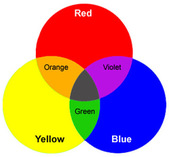
Complementary colors are pairs of colors which, when combined together, cancel each other out. This means that when mixed, they produce a neutral color like gray, brown or black. When placed next to each other, they create the strongest contrast for those two colors.
Complementary colors are pairs of colors which, when combined together, cancel each other out. This means that when mixed, they produce a neutral color like gray, brown or black. When placed next to each other, they create the strongest contrast for those two colors.
The high contrast of complementary colors creates a vibrant look especially when used at full saturation. 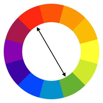

|
The high contrast of complementary colors creates a vibrant look especially when used at full saturation as below:

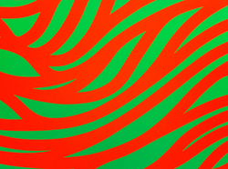
The high contrast of complementary colors creates a vibrant look especially when used at full saturation as to the left! See how the colors vibrate!
Watch this Video about tints, shades tonestones... youtu.be/q7STpNRwzzc
Watch this video for Color Theory: youtu.be/L1CK9bE3H_s
Tints are created when you add white to any hue on the color wheel. This will lighten and desaturate the hue, making it less intense. Tints are often referred to as pastel colors, and many feel they are calmer, quieter colors. To make the tints below, I used equal parts white and the hue straight from the bottle. Again, the amounts needed will vary by manufacturer and paint variety, depending on the intensity of the pigment in a given paint.
Tones are created when you add both black and white to a hue. You could also say greyhas been added. Depending on the proportions of black, white and the original hue used, tones can be darker or lighter than the original hue, and will also appear less saturated or intense than the original hue. Tones can reveal subtle and complex qualities in a hue or combination of hues, and are more true to the way we see colors in the real world.
Shades are created when only black is added to a hue. This results in a rich, often more intense and darker color. Because of the overpowering nature of many black pigments, adding black to a hue is a tricky and sometimes frustrating exercise when mixing paint. Many blacks will change the character of a hue even in small amounts, so they should be used sparingly. Alternatively, a hue can often be made darker by adding another dark hue rather than black. Testing different mixtures is the best approach.
about color pencils: youtu.be/luC6GMVBlbw
